

如何:创建 Excel 2016 图表
Microsoft Excel 2016 引入了多种图表类型,可帮助您可视化财务、统计和分层数据:
本主题介绍如何使用电子表格文档 API 在应用程序中创建和自定义这些图表类型。您可以打印 Excel 2016 图表并将其导出为 PDF。
您可以采用与任何其他图表类型相同的方式将 Excel 2016 图表添加到工作表中。调用 Worksheet.Charts.Add 方法并传递 ChartType 枚举成员。
了解如何使用电子表格文档 API 创建和定位图表。
有关每种 Excel 2016 图表类型(可用选项和代码示例)的详细信息,请参阅以下部分。
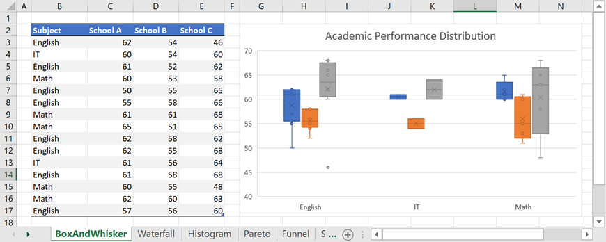
使用图表的 Series.LayoutOptions.BoxAndWhisker 属性定义 Box 和 Whisker 数据系列的选项。
| 属性 | 描述 |
| BoxAndWhiskerSeriesOptions.ShowInnerPoints |
指定是否显示位于下须线和上须线之间的内部数据点。 |
| BoxAndWhiskerSeriesOptions.ShowOutlierPoints |
指定是否显示位于下晶须线下方或上晶须线上方的异常值数据点。 |
| BoxAndWhiskerSeriesOptions.ShowMeanLine |
指定是否显示连接序列中框均值的线。 |
| BoxAndWhiskerSeriesOptions.ShowMeanMarkers |
指定是否显示平均标记。 |
| BoxAndWhiskerSeriesOptions.QuartileCalculationMethod |
定义四分位数计算方法。 |
| Vb.Net |
'创建一个方框图并指定其位置。 Dim chart As DevExpress.Spreadsheet.Charts.Chart = worksheet.Charts.Add(DevExpress.Spreadsheet.Charts.ChartType.BoxAndWhisker, worksheet("B2:E17")) chart.TopLeftCell = worksheet.Cells("G2") chart.BottomRightCell = worksheet.Cells("N17") '设置值轴的最小值和最大值。 Dim axis As DevExpress.Spreadsheet.Charts.Axis = chart.PrimaryAxes(1) axis.Scaling.AutoMax = False axis.Scaling.Max = 70 axis.Scaling.AutoMin = False axis.Scaling.Min = 40 '指定系列选项。 For Each series As DevExpress.Spreadsheet.Charts.Series In chart.Series Dim options As DevExpress.Spreadsheet.Charts.BoxAndWhiskerSeriesOptions = series.LayoutOptions.BoxAndWhisker options.ShowInnerPoints = True options.ShowMeanLine = False options.ShowOutlierPoints = True options.ShowMeanMarkers = True options.QuartileCalculationMethod = DevExpress.Spreadsheet.Charts.QuartileCalculationMethod.ExclusiveMedian Next series '添加图表标题。 chart.Title.Visible = True chart.Title.SetValue("Academic Performance Distribution") |
| C# |
// 创建一个方框图并指定其位置。 DevExpress.Spreadsheet.Charts.Chart chart = worksheet.Charts.Add(DevExpress.Spreadsheet.Charts.ChartType.BoxAndWhisker, worksheet["B2:E17"]); chart.TopLeftCell = worksheet.Cells["G2"]; chart.BottomRightCell = worksheet.Cells["N17"]; // 设置值轴的最小值和最大值。 DevExpress.Spreadsheet.Charts.Axis axis = chart.PrimaryAxes[1]; axis.Scaling.AutoMax = false; axis.Scaling.Max = 70; axis.Scaling.AutoMin = false; axis.Scaling.Min = 40; // 指定系列选项。 foreach (DevExpress.Spreadsheet.Charts.Series series in chart.Series) { DevExpress.Spreadsheet.Charts.BoxAndWhiskerSeriesOptions options = series.LayoutOptions.BoxAndWhisker; options.ShowInnerPoints = true; options.ShowMeanLine = false; options.ShowOutlierPoints = true; options.ShowMeanMarkers = true; options.QuartileCalculationMethod = DevExpress.Spreadsheet.Charts.QuartileCalculationMethod.ExclusiveMedian; } // 添加图表标题。 chart.Title.Visible = true; chart.Title.SetValue("Academic Performance Distribution"); |
箱须图
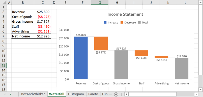
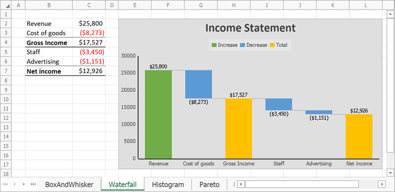
使用图表的 Series.LayoutOptions.Waterfall 属性指定瀑布流数据系列的选项。
| 属性 | 描述 |
| WaterfallSeriesOptions.ShowConnectorLines |
指定是否显示数据点之间的连接线。 |
| WaterfallSeriesOptions.SubtotalDataPoints |
返回总点数的集合。 |
| Vb.Net |
'创建瀑布图并指定其位置。 Dim chart As DevExpress.Spreadsheet.Charts.Chart = worksheet.Charts.Add(DevExpress.Spreadsheet.Charts.ChartType.Waterfall, worksheet("B2:C7")) chart.TopLeftCell = worksheet.Cells("E2") chart.BottomRightCell = worksheet.Cells("L17") '隐藏值轴的主要网格线。 chart.PrimaryAxes(1).MajorGridlines.Visible = False '指定系列选项。 Dim options As DevExpress.Spreadsheet.Charts.WaterfallSeriesOptions = chart.Series(0).LayoutOptions.Waterfall '显示连接器线路。 options.ShowConnectorLines = True '将第三个数据点设置为求和 options.SubtotalDataPoints.Add(2) '将最后一个数据点设置为求和。 options.SubtotalDataPoints.Add(5) '添加图表标题。 chart.Title.Visible = True chart.Title.SetValue("Income Statement") |
| C# |
// 创建瀑布图并指定其位置。 DevExpress.Spreadsheet.Charts.Chart chart = worksheet.Charts.Add(DevExpress.Spreadsheet.Charts.ChartType.Waterfall, worksheet["B2:C7"]); chart.TopLeftCell = worksheet.Cells["E2"]; chart.BottomRightCell = worksheet.Cells["L17"]; // 隐藏值轴的主要网格线。 chart.PrimaryAxes(1).MajorGridlines.Visible = false; // 指定系列选项。 DevExpress.Spreadsheet.Charts.WaterfallSeriesOptions options = chart.Series[0].LayoutOptions.Waterfall; // 显示连接器线路。 options.ShowConnectorLines = true; // 将第三个数据点设置为求和 options.SubtotalDataPoints.Add(2); // 将最后一个数据点设置为求和。 options.SubtotalDataPoints.Add(5); // 添加图表标题。 chart.Title.Visible = true; chart.Title.SetValue("Income Statement"); |
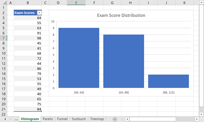
使用图表的 Series.LayoutOptions.Histogram 属性指定直方图数据系列的选项。
| 属性 | 描述 |
| HistogramSeriesOptions.BinType |
指定如何计算直方图的条柱。 |
| HistogramSeriesOptions.BinCount |
定义直方图条柱的数量。 |
| HistogramSeriesOptions.BinWidth |
定义图格大小。 |
| HistogramSeriesOptions.OverflowType, |
允许您为高于特定值的所有值创建 bin。 |
| HistogramSeriesOptions.OverflowValue | |
| HistogramSeriesOptions.UnderflowType, |
允许您为低于或等于特定值的所有值创建条柱。 |
| HistogramSeriesOptions.UnderflowValue | |
| HistogramSeriesOptions.IntervalClosedSide |
指定箱封闭侧。 |
| Vb.Net |
'创建直方图并指定其位置。 Dim chart As DevExpress.Spreadsheet.Charts.Chart = worksheet.Charts.Add(DevExpress.Spreadsheet.Charts.ChartType.Histogram, worksheet("B2:B21")) chart.TopLeftCell = worksheet.Cells("D2") chart.BottomRightCell = worksheet.Cells("K18") '指定直方图系列选项。 Dim options As DevExpress.Spreadsheet.Charts.HistogramSeriesOptions = chart.Series(0).LayoutOptions.Histogram options.BinType = DevExpress.Spreadsheet.Charts.HistogramBinType.BinWidth options.BinWidth = 24 '指定间隙宽度。 chart.Series(0).GapWidth = 10 '添加图表标题。 chart.Title.Visible = True chart.Title.SetValue("Exam Score Distribution") |
| C# |
// 创建直方图并指定其位置。 DevExpress.Spreadsheet.Charts.Chart chart = worksheet.Charts.Add(DevExpress.Spreadsheet.Charts.ChartType.Histogram, worksheet["B2:B21"]); chart.TopLeftCell = worksheet.Cells["D2"]; chart.BottomRightCell = worksheet.Cells["K18"]; // 指定直方图系列选项。 DevExpress.Spreadsheet.Charts.HistogramSeriesOptions options = chart.Series[0].LayoutOptions.Histogram; options.BinType = DevExpress.Spreadsheet.Charts.HistogramBinType.BinWidth; options.BinWidth = 24; // 指定间隙宽度。 chart.Series[0].GapWidth = 10; // 添加图表标题。 chart.Title.Visible = true; chart.Title.SetValue("Exam Score Distribution"); |
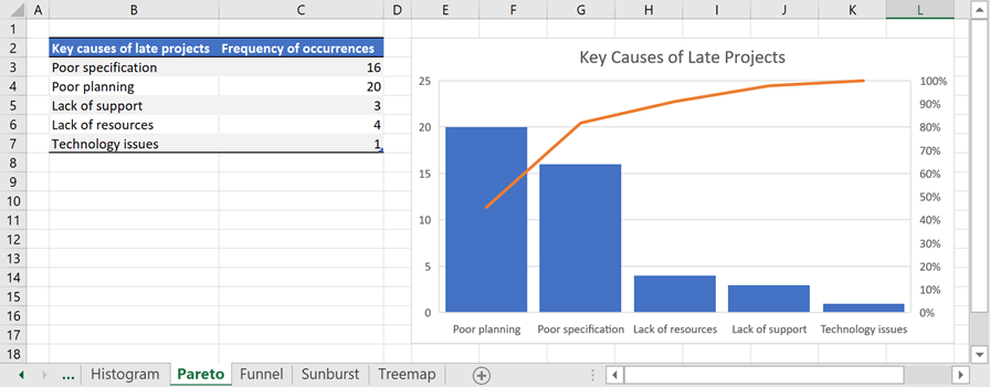
使用图表的 Series.LayoutOptions.Histogram 属性指定 Pareto 数据序列的条柱选项。
请参阅直方图系列选项。
| Vb.Net |
'创建帕累托图并指定其位置。 Dim chart As DevExpress.Spreadsheet.Charts.Chart = worksheet.Charts.Add(DevExpress.Spreadsheet.Charts.ChartType.Pareto, worksheet("B2:C7")) chart.TopLeftCell = worksheet.Cells("E2") chart.BottomRightCell = worksheet.Cells("L17") '指定系列选项。 Dim options As DevExpress.Spreadsheet.Charts.HistogramSeriesOptions = chart.Series(0).LayoutOptions.Histogram options.BinType = DevExpress.Spreadsheet.Charts.HistogramBinType.ByCategory '指定间隙宽度。 chart.Series(0).GapWidth = 15 '添加图表标题。 chart.Title.Visible = True chart.Title.SetValue("Key Causes of Late Projects") |
| C# |
// 创建帕累托图并指定其位置。 DevExpress.Spreadsheet.Charts.Chart chart = worksheet.Charts.Add(DevExpress.Spreadsheet.Charts.ChartType.Pareto, worksheet["B2:C7"]); chart.TopLeftCell = worksheet.Cells["E2"]; chart.BottomRightCell = worksheet.Cells["L17"]; // 指定系列选项。 DevExpress.Spreadsheet.Charts.HistogramSeriesOptions options = chart.Series[0].LayoutOptions.Histogram; options.BinType = DevExpress.Spreadsheet.Charts.HistogramBinType.ByCategory; // 指定间隙宽度。 chart.Series[0].GapWidth = 15; // 添加图表标题。 chart.Title.Visible = true; chart.Title.SetValue("Key Causes of Late Projects"); |
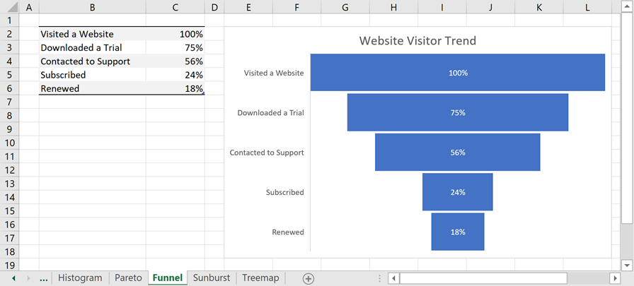
漏斗图不包括特定于类型的选项。
| Vb.Net |
'创建一个漏斗图并指定其位置。 Dim chart As DevExpress.Spreadsheet.Charts.Chart = worksheet.Charts.Add(DevExpress.Spreadsheet.Charts.ChartType.Funnel, worksheet("B2:C6")) chart.TopLeftCell = worksheet.Cells("E2") chart.BottomRightCell = worksheet.Cells("L18") '添加图表标题。 chart.Title.Visible = True chart.Title.SetValue("Website Visitor Trend") |
| C# |
// 创建一个漏斗图并指定其位置。 DevExpress.Spreadsheet.Charts.Chart chart = worksheet.Charts.Add(DevExpress.Spreadsheet.Charts.ChartType.Funnel, worksheet["B2:C6"]); chart.TopLeftCell = worksheet.Cells["E2"]; chart.BottomRightCell = worksheet.Cells["L18"]; // 添加图表标题。 chart.Title.Visible = true; chart.Title.SetValue("Website Visitor Trend"); |
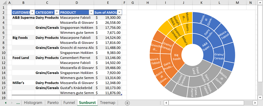
旭日图不包括特定于类型的选项。
| Vb.Net |
'创建旭日图表并指定其位置。 Dim chart As DevExpress.Spreadsheet.Charts.Chart = worksheet.Charts.Add(DevExpress.Spreadsheet.Charts.ChartType.Sunburst, worksheet("B2:E18")) chart.TopLeftCell = worksheet.Cells("G2") chart.BottomRightCell = worksheet.Cells("N19") '隐藏图表标题。 chart.Title.Visible = False |
| C# |
// 创建旭日图表并指定其位置。 DevExpress.Spreadsheet.Charts.Chart chart = worksheet.Charts.Add(DevExpress.Spreadsheet.Charts.ChartType.Sunburst, worksheet["B2:E18"]); chart.TopLeftCell = worksheet.Cells["G2"]; chart.BottomRightCell = worksheet.Cells["N19"]; // 隐藏图表标题。 chart.Title.Visible = false; |
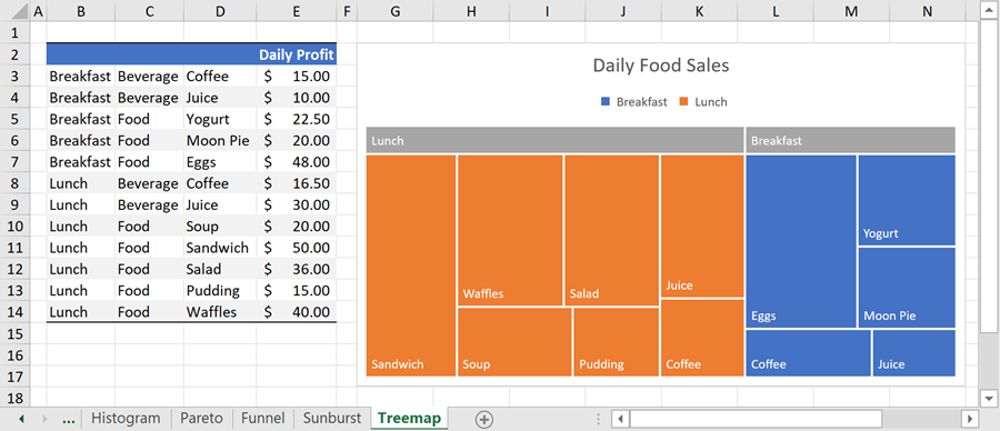
使用图表的 Series.LayoutOptions.Treemap 属性指定树状图数据系列的选项。
| 属性 | 描述 |
| TreemapSeriesOptions.ParentLabelLayout |
定义父标签的布局。 |
| Vb.Net |
'创建树图并指定其位置。 Dim chart As DevExpress.Spreadsheet.Charts.Chart = worksheet.Charts.Add(DevExpress.Spreadsheet.Charts.ChartType.Treemap, worksheet("B2:E14")) chart.TopLeftCell = worksheet.Cells("G2") chart.BottomRightCell = worksheet.Cells("N17") '指定系列选项。 Dim options As DevExpress.Spreadsheet.Charts.TreemapSeriesOptions = chart.Series(0).LayoutOptions.Treemap options.ParentLabelLayout = DevExpress.Spreadsheet.Charts.TreemapParentLabelLayout.Banner '添加图表标题。 chart.Title.Visible = True chart.Title.SetValue("Daily Food Sales") |
| C# |
// 创建树图并指定其位置。 DevExpress.Spreadsheet.Charts.Chart chart = worksheet.Charts.Add(DevExpress.Spreadsheet.Charts.ChartType.Treemap, worksheet["B2:E14"]); chart.TopLeftCell = worksheet.Cells["G2"]; chart.BottomRightCell = worksheet.Cells["N17"]; // 指定系列选项。 DevExpress.Spreadsheet.Charts.TreemapSeriesOptions options = chart.Series[0].LayoutOptions.Treemap; options.ParentLabelLayout = DevExpress.Spreadsheet.Charts.TreemapParentLabelLayout.Banner; // 添加图表标题。 chart.Title.Visible = true; chart.Title.SetValue("Daily Food Sales"); |
您可以使用以下样式和颜色自定义 API 更改 Excel 2016 图表的外观:
| 属性 | 描述 |
| Chart.Style | 指定图表样式。Excel 2016 图表有几种预定义样式:Style1 ... style9. |
| Chart.ColorPalette |
定义 Excel 2016 图表的调色板。 |
| ChartObject.LoadStyle |
允许您将自定义样式应用于 Excel 2016 图表。 |
下面的示例演示了如何创建瀑布图并指定其颜色和样式。
更改瀑布图的图表样式和调色板
| Vb.Net |
'创建瀑布图并指定其位置。 Dim chart As DevExpress.Spreadsheet.Charts.Chart = worksheet.Charts.Add(DevExpress.Spreadsheet.Charts.ChartType.Waterfall, worksheet("B2:C7")) chart.TopLeftCell = worksheet.Cells("E2") chart.BottomRightCell = worksheet.Cells("L17") '隐藏值轴的主要网格线。 chart.PrimaryAxes(1).MajorGridlines.Visible = False '指定系列选项。 Dim options As DevExpress.Spreadsheet.Charts.WaterfallSeriesOptions = chart.Series(0).LayoutOptions.Waterfall '显示连接器线路。 options.ShowConnectorLines = True '将第三个数据点设置为总数。 options.SubtotalDataPoints.Add(2) '将最后一个数据点设置为总数。 options.SubtotalDataPoints.Add(5) '指定图表样式。 chart.Style = DevExpress.Spreadsheet.Charts.ChartStyle.Style3 '更改图表颜色。 chart.ColorPalette = DevExpress.Spreadsheet.Charts.ChartColorPalette.Colorful4 '添加图表标题。 chart.Title.Visible = True chart.Title.SetValue("Income Statement") |
| C# |
// 创建瀑布图并指定其位置。 DevExpress.Spreadsheet.Charts.Chart chart = worksheet.Charts.Add(DevExpress.Spreadsheet.Charts.ChartType.Waterfall, worksheet["B2:C7"]); chart.TopLeftCell = worksheet.Cells["E2"]; chart.BottomRightCell = worksheet.Cells["L17"]; // 隐藏值轴的主要网格线。 chart.PrimaryAxes[1].MajorGridlines.Visible = false; // 指定系列选项。 DevExpress.Spreadsheet.Charts.WaterfallSeriesOptions options = chart.Series[0].LayoutOptions.Waterfall; // 显示连接器线路。 options.ShowConnectorLines = true; // 将第三个数据点设置为总数。 options.SubtotalDataPoints.Add[2]; // 将最后一个数据点设置为总数。 options.SubtotalDataPoints.Add[5]; // 指定图表样式。 chart.Style = DevExpress.Spreadsheet.Charts.ChartStyle.Style3; // 更改图表颜色。 chart.ColorPalette = DevExpress.Spreadsheet.Charts.ChartColorPalette.Colorful4; // 添加图表标题。 chart.Title.Visible = true; chart.Title.SetValue("Income Statement"); |
将 Excel 2016 图表打印或导出为 PDF 时存在以下限制:
| 图表类型 | 局限性 |
| All charts | 1. 电子表格文档 API 只能为图表区域呈现一种渐变填充样式:带有两个色标的线性渐变填充。其他渐变类型将替换为实心填充。 |
| 2.应用于图表区或数据系列的图案填充将替换为实心填充。 | |
| Box and whisker | 1. 不显示数据标签。 |
| 2.将 Series.Gap宽度属性值被忽略。 | |
| Waterfall | 数据值为空的图表显示不正确。 |
| Treemap | 1.不支持重叠布局选项。如果为图表启用此选项,电子表格会将父标签呈现为类别上方的横幅。 |
| 2.横幅标签没有背景填充。 |